The Uncommon Muse is a blog written “By women. For women. About women.”
I’ve been reading for about a year, and I keep coming back because of the creative content and aesthetic style of the site. The general tone of the brand is witty, intelligent and feminist, and features articles from many different female authors on subjects of business, humor, style and travel.
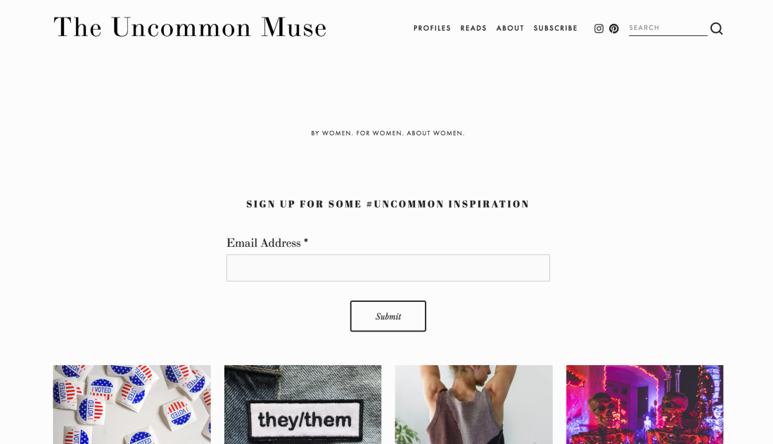
When first entering the site, users are greeted by an opportunity to sign up for the email list, but it’s done in a very casual and unobtrusive way with a clean, simple design at the top of the page so you can still see the first grid of content. 
I like the use of empty space instead of bombarding readers with content or ads, because it feels much more pleasant to scroll through.
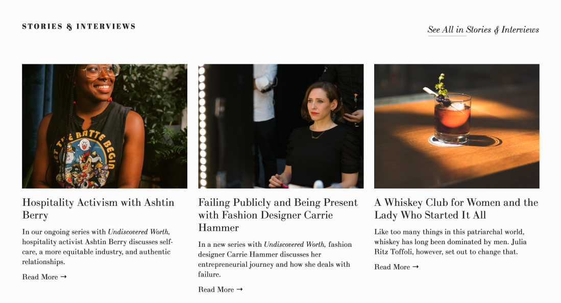
The first big block of content is a featured article, with a clear call to action button on top of an engaging and relevant photo. It’s followed by a row of similar stories, which are all interviews. The visual variety here is compelling because they used actual photography instead of stock photos, which seems more authentic. The sizes and formats of the fonts create visual hierarchy that help me distinguish between categories, headlines, subheads and CTAs. 
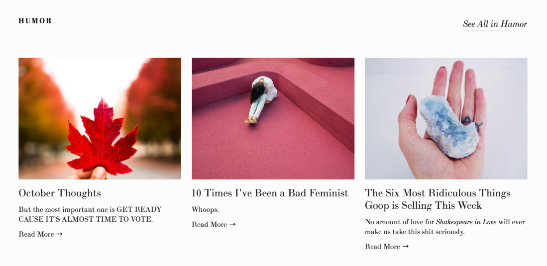
I really like this blog because the content is relevant to me, and approachable to a variety of women without being watered down. The stories are funny and thought-provoking, but short enough that I could read in a few minutes. The formats of each article are varied, which breaks up the monotony that I generally feel when browsing through articles on lifestyle magazines. Some are lists, Q&As, longform, photo essays, etc.
The photography, even when it’s a stock image, is beautiful and clean and bright, without being over saturated. I also like that they don’t put a ton of photos in each article because that makes it hard to scroll through on mobile.

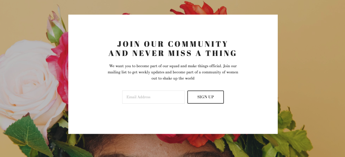
Further down the page, there’s another CTA to subscribe, which is much busier than the original subscribe button at the top of the page, but since it’s after all the main content on the page, it isn’t interrupting actual content. The language is casual and funny, with ‘make things official,’ which is approachable while still being very clear. 
Overall, I love this site and think they have made intentional and thoughtful efforts with their content and format.